Forever a poster couple


During a golden age when graphic design flowered as never before, art was put to work on posters, labels and products of all sorts, becoming a familiar part of our daily scene before being discarded by the ton as the cavalcade moved on.
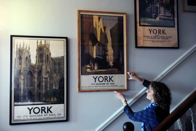
Here’s one example of art, its boots on and its sleeves rolled up, being given a vital job to perform. British Rail carriages used to be divided into compartments, each with a sliding door. Six passengers, sometimes more, faced each other almost knee-to-knee. All were anxious to avoid eye contact after boarding the train and so, placed directly above the person sitting opposite, was a soothing watercolour landscape or similar. These could be gazed at fixedly until unease at the proximity of strangers wore off.
Advertisement
Hide AdAdvertisement
Hide AdDick and Sue Raines have several of these railway prints and looking at them brings back in an instant the sounds and the smells, the lumpy sprung seats, the mustiness, the whole experience of claustrophobic rail journeys of yesteryear.
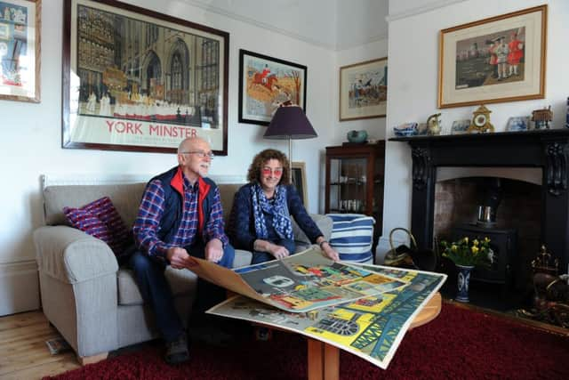
The Raines have spent over 40 years fishing out these pictures – and hundreds of other remnants of commercial art – from forgotten corners. “Our collecting passion is for jobbing artists working roughly from the end of the First World War to the release of the Beatles’ first LP,” says Dick. Their work was by its nature ephemeral but Sue and Dick believe the material that has survived has a quality that deserves permanence. And you see the strength of feeling they have for it by the fact that it covers most of the wall space in their house in York.
Pride of place is given to one of two railway posters they purchased 40 years ago when they started out. Two was all they could afford at 10 shillings and sixpence each. The posters’ value had barely risen since the originals had been made available in the Thirties for seven and sixpence “by application to the station manager”. Today art inflation has bumped this up.
“The 1920s to the 1950s were the golden age of railway posters,” says Dick. “Prints by lithography give you very good areas of flat colour and the designs, typefaces and colours are extremely attractive. The railway companies employed some superb artists. LNER’s were Frank Newbould, Frank Mason, Tom Purvis, Austin Cooper and Fred Taylor. Between them they produced some absolute corkers.”
Advertisement
Hide AdAdvertisement
Hide AdThe posters they can afford may well be damaged where they have been folded, in which case they call on a friend, Ruth Mathias, a freelance paper conservator, who looks after the National Railway Museum’s collection, to bring her skills to bear on restoring them.
Just inside the front door are two railway posters with giant portraits of local types who once characterised coastal regions. One is titled “No 1 Broads Wherryman” and the other “Number 4 Scottish Fisherwoman”. “They are from a set of six, real finds,” says Dick. Tracking down the other four, as well as the missing numbers from other part-sets which they have unearthed, may require years of detective work. And if they do turn something up, there’s now a question of what to do about it. “There’s no more space left on the walls,” says Sue.
The couple’s design business researches, writes, designs and builds exhibitions for museums, visitor centres and heritage sites. Their latest commission is from York Minster. Professional necessity is what prompted them to begin collecting in earnest. “We went hunting for out-of-copyright books to illustrate exhibitions we were mounting,” says Sue. To the same end they also went searching in unlikely places for old postcards, cigarette cards, political cartoons in old magazines – all of it useful art.
Sue pulls out another sheaf of recent finds: charmingly illustrated blanks for Post Office greetings telegrams. “It’s social history, isn’t it? To a youngster today you are first going to have to explain what a telegram is, or was. Will guests at a wedding find the same satisfaction and sense of occasion in hearing someone reading out congratulatory tweets, or emails?”
Advertisement
Hide AdAdvertisement
Hide AdDick’s late father was a doctor and art historian whose private passion was also collecting. There is art from the 1750s which he collected along with the Raines’ acquisitions from young artists working today in York on the walls. Elsewhere there are panto posters once produced by Taylors of Wombwell in South Yorkshire. Now very collectable, tons of their stuff was once dumped in skips.
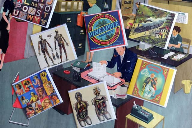
The couple’s broad interest in the visual arts of the first half of the 20th century has now extended to product labels. American fruit producers spent a lot of money creating eye-catching designs to identify their tangerines, melons and pineapples. British fabric manufacturers took great pains to make sure that the tiny labels they attached to their export products would mark them out from the rest on distant quaysides. Their high- quality graphics and other vintage typography and illustrations are now getting a new lease of life in the form of greetings cards which the Raines call Oddcards.
There’s a glint in the eye as the couple start to discuss whether to pursue an item from one of their incomplete posters sets on eBay. “Collecting is more than a hobby really. It’s a disease,” says Dick.
They look at each other.
“When will it end?”
“Never.”
• www.dickrainesdesign.com