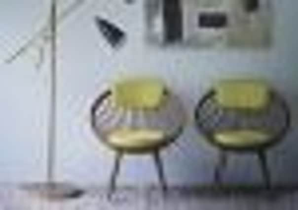
Add a little sunshine to your home


The sun can’t always be relied on to make an appearance in Britain, which is why yellow is a perennial favourite colour.
It brings warmth and light to a room and is guaranteed to give the gloomiest space a lift.
Advertisement
Hide AdAdvertisement
Hide AdThe Georgians, who knew a thing or two about interior design, loved it and it was a favourite of great 18th century architect Robert Adam. He showed that yellow works just as well in narrow stairways and corridors as it does in enormous light-filled rooms and grand entrance halls, especially when ornate plasterwork and fireplaces are picked out in white.


This year you’ll see a lot more of the colour in the shops. The catwalks for spring summer featured it heavily and where fashion leads homeware generally follows.
It’s everywhere, including on the floor with mustardy carpets, which look good teamed with off white walls and green accessories.
For walls, Farrow and Ball have a beautiful Versailles baroque paper in yellow, which again works well with white.
Advertisement
Hide AdAdvertisement
Hide AdIf you don’t fancy yellow on the walls or floor, there is plenty of furniture sporting the shade including the new Jefferson chair from Marks and Spencer and sofas from Harrogate-based designer makers Naughtone (www.naughtone.com.


Take your pick of accessories from daffodils to cushions and throws.
As a backdrop against these, the aforementioned white is excellent but grey is another good stable mate. Grand Designs Kevin McCloud has come up with a gorgeous Skylon grey for Fired Earth, which works perfectly.
Yellow works well in most rooms, but especially in a kitchen when teamed with white, green or blue and in children’s bedrooms, as long as there isn’t too much and it isn’t too vibrant.
Advertisement
Hide AdAdvertisement
Hide AdIf you are using in a sitting room, opt for more red in the yellow, rather than the sharper lemon shades, as this will be warmer.
If you are using it in a south facing room, go for a paler tone to avoid it being overbearingly bright.
Avoid putting what is a very dominant primary colour with too much bright red, which can be over stimulating. A little red in the form of curtains or one piece of furniture can look amazing, but it’s a fine line.
Another potential problem is putting yellow and black together, which poses the obvious threat of resembling a bee.
Advertisement
Hide AdAdvertisement
Hide AdIt also might be worth bearing in mind colour therapists’ advice.
Too much yellow is said to over stimulate the brain and can apparently inspire aggression and exacerbate feelings of distress.
So, unless you live in a Georgian pile, you might want to adopt a less is more approach.
BRING ME SUNSHINE
• Yellow is seen as a sunny, positive colour, which is said to stimulate the intellect. That’s one of the reason why it is used a lot in schools and work places.
Advertisement
Hide AdAdvertisement
Hide Ad• It also raises the spirits and is often used by colour therapists to treat depression.
• It works best in hallways, as it is very welcoming, and will brighten up north-facing rooms. Yellow can also stimulate the appetite, which is why it works well in dining rooms.
• Keep it soft and low key in bedrooms, as too much can encourage hyperactivity.