
Northern Lights: A new look, the same mission
A few weeks ago, we shared some big news - we have said goodbye to our old name, and we’re once again known as Sheffield Children’s Hospital Charity.
As a charity, we are committed to helping change the lives of patients, families and staff at Sheffield Children's, and are so very proud to do so. We want this to be clear in everything our brand represents, which includes our name.
The charity has seen considerable growth in scope and impact over the last few years, and has big ambitions for the future, so it felt like the right time to review and refine the brand we have to ensure it best represents who we are, and our commitment to driving a world of excellence and innovation in children’s healthcare. It’s more than just a new name and logo – it’s about better reflecting who we are, and why we’re here.
Thanks to our incredible supporters, for almost fifty years we have been supporting the thousands of patients and families at Sheffield Children’s, from across the UK and beyond, by funding the life-changing and the joy-sparking. We make clinical care kinder, and bad days brighter. We bring play, laughter and comfort to places where they’re needed the most.
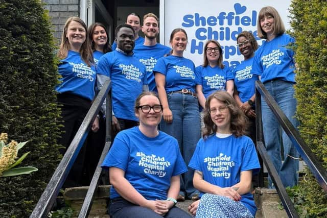

The charity works in partnership with Sheffield Children’s to create healthier futures for children and young people. In 2021, we completed the £2.75 million transformation of the Haematology and Oncology Ward and, more recently, at the end of last year, we were proud to see the launch of the hospital’s brand new helipad, thanks to £6million of charity funding.
But there is still so much more we need to do, and we hope our refreshed brand will help enable us to make those ambitions a reality, alongside the Trust. We want to stand out, inspire people to support us, and show the impact that support will have, especially as we head into such a milestone year in 2026, when we will celebrate the 150th anniversary of Sheffield Children’s.
This refresh is very much an evolution, not a revolution. We are proud of the positive sentiment towards elements of the previous brand and wanted to be respectful to the things so well-loved by our supporters, so you will see our famous blue and yellow colour palette still remains, as well as our beloved Theo bear, but we now have a finessed brand that is more accessible, inclusive and flexible.
We know it’s the hearts of our supporters and donors that enable the charity to make such a positive difference to the lives of children and young people – the same children and young people that we keep at the heart of everything we do. What better way to show that than with a heart in our new logo. We were honoured to have Florence Bark – an 8-year-old patient at Sheffield Children’s – draw this heart for us.
Our brand has been designed in collaboration with children, and with children in mind. It brings together everything we stand for, and our belief that every child deserves access to excellent healthcare and a healthy future. We wanted that to come through in all elements, so we worked with creative agency, Eleven, who reinvigorate existing brands to help clients tell stories and connect with audiences. The new brand identity uses a dynamic combination of colours, shapes and other identifiers to bring to life the charity’s personality and vision.
We have a fantastic new suite of photography, thanks to Owen Richards, which perfectly captures the variety of journeys and experiences the Trust’s patients, families and staff will embark on. These images will allow us to enhance emotional connections and storytelling capabilities.
The Trust’s patients each have their own story and journey, and we want to be able to authentically tell those stories with the compassion and inclusivity that is represented in our values.
In collaboration with the Trust’s patients and other children and young people, we are also championing diversity and inclusivity by expanding Theo’s world to create a series of supporting characters, inspired by what these participants think would be the perfect ‘friend’ to relate to, engage with, and support others. There will be more updates on Theo’s friends coming soon.
The refreshed brand will be used consistently across all charity touchpoints, including a new website, fundraising collateral and merchandise. This will be delivered in a phased roll-out across the coming months.
We launched the first major campaign in this new identity just last week at Yorkshire Wildlife Park. Our Pride of Yorkshire sculpture trail is coming to the region in 2026 and we're looking for sponsors, artists and schools to get on board now. You can find out more about it by visiting prideofyorkshire.org.
While we may be heading into the summer with a fresh new look, we remain unchanged in our ongoing dedication to funding life-changing care, comfort and new ideas to transform children’s healthcare.
Thank you for your ongoing support. Together we make the difference.