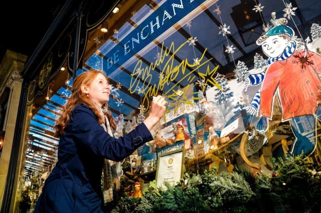
Meet the artist who has branded Bettys for their 100th anniversary


Bettys has long been associated with traditional elegance and the tearooms’ buildings and interiors offer a generous helping of refined yet welcoming ambience and a perfect slice of timeless good taste. This is precisely what is conveyed by the special centenary branding and products that have been created for the company by York-based artist and illustrator Emily Sutton with whom they have collaborated on several projects over the past few years.
Sutton’s first commission from Bettys was to illustrate the 2011 book Who Was Betty? Since Bettys was established in 1919 there has been one question that has remained unanswered – who exactly was the mysterious Betty? Various theories have been suggested, but the company, wisely, has never revealed her identity. The book was a whimsical collection of poems, stories and thoughts on who the elusive figure might be, with contributions from Yorkshire writers including Alan Ayckbourn, Joanne Harris, Gervase Phinn, Barbara Taylor Bradford, Alan Titchmarsh and Ian McMillan, among others.
Advertisement
Hide AdAdvertisement
Hide Ad“I really enjoyed illustrating the book and then after that I did a tea caddy for them and since then I’ve done quite a lot with them,” says Sutton. “I tend to do a lot of exhibitions around the country, so it’s nice to be working closer to home and to have my work associated with such a renowned Yorkshire brand. I have always really enjoyed making designs for packaging because I love lettering – it features in a lot of my work. I have often in the past been inspired by Victorian packaging and that ties in well with the work I have done for Bettys’ centenary.”


The design is simple, clean-cut and effective. An elegant pen and ink, black and white drawing of all six of Bettys locations – the Harrogate, Ilkely, Northallerton branches, the café at RHS Harlow and the two tea-rooms in York – side by side, with a gold trim. “My process tends to be the same for all the products I do,” says Sutton. “I go in for a meeting and the design and marketing team will have decided the look they are going for. For their centenary Bettys wanted a classical, slightly formal look and that really summed up the idea of the company being around for a hundred years, getting all the branches in and keeping the style very pared back and without much colour. They wanted something that was about the architecture and detail of all the buildings without too many distractions. And they wanted some gold in it – the aim was for it to be collectable and classic.”
Much of Sutton’s work has been inspired by cities and her delicate, finely detailed paintings and illustrations reflect her interest in the built environment. More recently, however, her work has also featured nature and the countryside. “Over the last few years I have been doing more landscape work but earlier in my career I was particularly interested in shopfronts and signage, so this felt like going back to familiar territory and it ties in more with my illustrations than my watercolours.”
Sutton has created designs for a teapot, a mug, a cake tin and a tea caddy, plus a special limited edition screenprint.
Advertisement
Hide AdAdvertisement
Hide AdShe has also done all the branding for the menus which will be in use in all the branches throughout this centenary year.
“It is the same basic idea for all of them, but I did two versions because the dimensions are different for the tins and mugs.
“On the mug it is a slightly shorter version but the overall effect and impression is the same; for the menus that was a separate concept but still using the black, white and gold. And when I did the screenprint I tried to do it in a very linear way so we definitely got that graphic look.”
Sutton has had a busy year so far. She is currently working on the illustrations for The Ups and Downs of the Castle Mice, sequel to The Tale of the Castle Mice, the second book she has illustrated for legendary Paddington author Michael Bond who died in 2017 at the age of 91.
Advertisement
Hide AdAdvertisement
Hide AdShe had the pleasure of meeting Bond – and eating marmalade sandwiches with him at his home – shortly after the publication of the first book in the summer of 2016. She is also illustrating two more children’s books for Walker Books as well as working on her own children’s book, creating large-scale paintings for P&O’s latest new cruise ship and preparing for a solo exhibition in Edinburgh next year.
Sutton says that she has enjoyed all her projects with Bettys and this one has been no exception. “When I first started working with them it was a milestone moment for me in my career and now I have quite a lot of history with them. They are great.” And, of course, there are certain perks that come with a Bettys collaboration.
“There are always lovely cakes when you go in for meetings,” she says, laughing. “And there is something very special about walking past the café in York and seeing my work on display.”
Bettys centenary merchandise featuring Emily Sutton’s illustration is available from the Bettys cafes in York, Ilkley, Harrogate, Northallerton and Harlow Carr and online from www.bettys.co.uk
■ Emily Sutton www.emilystutton.co.uk